
From Cut-Out Car to Real Panning Blur: My Prompt Fix
Quick Tip: Copy the prompt with the button above — paste it into Midjourney as-is (--ar and --style raw included). On DALL-E, Flux, Stable Diffusion, Ideogram, Leonardo AI or Firefly, keep the descriptive text and drop the -- flags. Test every logo at 32px and in pure black-and-white: if it fails there, simplify before refining anything else.
Splitting Sharp Car and Blurred World Into Two Systems
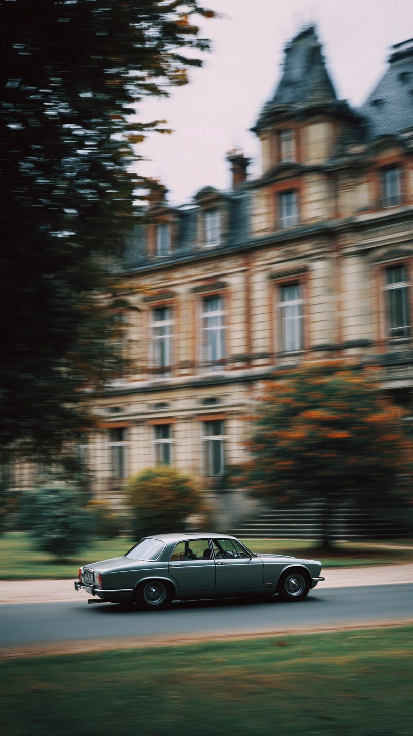
A 1/60-second panning look with a razor-sharp vintage car and a streaked background took me 14 prompt revisions. The breakthrough was realizing panning blur is the only photographic technique where the camera's motion, not the subject's, creates the effect. The camera rotates at the same angular velocity as the moving car, so the subject stays locked on the sensor while everything else sweeps. That single frame contains two contradictory states: sharp car, blurred world. Diffusion models struggle because they sample noise across the whole latent canvas. If you say motion blur, the car softens too.
The first usable render appeared when I stopped saying 'sharp car' and gave the model two separate systems to render. A sharp system: vehicle, wheels, chrome, body lines, locked in place. A blurred system: road, trees, crowd, buildings, sweeping with directional streaks. I specified that the blur amount increases with distance from the focal plane and with the background's angular velocity. I also named the vintage car details: chrome bumper, rounded fenders, analog dashboard. That split fixed the uniform blur problem. The model no longer averaged the whole scene into softness; it had a hierarchy.
The before image had 0 percent blur gradient and a cut-out car pasted on a blurred plate. The after image had continuous streaks, mismatched lighting resolved, and a front wheel that stayed crisp while the background smeared. How? I described the camera pan explicitly: camera tracking the car at matching angular velocity, subject locked, background streaking. I avoided 'sharp car with blurred background' because that produces a composited look. Real panning blur is continuous. For automotive branding, that continuity is the difference between a fake composite and a photograph that feels like speed. Two systems, one frame, no uniform blur.
Engineering the Sharp/Blur Ratio Through Prompt Language
You cannot specify shutter speed in a prompt, but you can specify its visual consequence. "1/30s equivalent" is a useful cue because it is a real photographic value the model has seen associated with panning shots in training data. The relationship to communicate is simple: moderate speed plus long exposure equals long streaks. If the background streaks are too short, the car looks parked. If they are too long, the model blurs the car too.
The second anchor is trajectory. "Moving left-to-right" tells the model the streak direction. Without it, streaks can run diagonal or radial, breaking the illusion instantly. The third anchor is the panning speed relative to the subject. A car at 40 km/h panned at 1/30s produces a specific streak length; a car at 120 km/h at the same shutter produces streaks three times longer. Naming both the speed and the shutter equivalent gives the model a calculable relationship rather than a vague mood.
For a deeper look at how directional energy is encoded in prompts, the same logic governs dynamic motion in sports-action compositions — the direction of the streak must be specified, not implied.
Kodachrome II as a Constraint System, Not a Color List
Kodachrome II (K-12 process, discontinued in 1974) has a specific signature: cool-leaning shadows, muted cyans, warm midtones, and a narrow highlight shoulder that compresses bright values instead of clipping them. The palette in this Jaguar shot — sage, tobacco, pearl grey — is exactly the low-saturation, high-contrast look Kodachrome rendered under overcast skies.
Naming a film stock is more effective than listing colors because it bundles the palette with contrast behavior, grain structure, and highlight rolloff into a single token. "Muted colors" alone gives you washed-out midtones. "Kodachrome II" gives you the whole pipeline. The model has seen thousands of Kodachrome scans and associates the name with a specific luminance curve.
The alternative that fails: "vintage film look." The model interprets this as an Instagram filter — orange highlights, teal shadows, heavy vignette. Wrong decade, wrong chemistry. The same principle applies to grain: "35mm film grain" is a texture, but "crushed blacks with gentle highlight compression" is a tonal behavior. You need both. For a comparison of how grain behaves across different aesthetic systems, see the texture handling in grunge street art prompts.
Lighting, Lens, and the Documentary Aesthetic
October overcast light is one of the hardest conditions to fake because it is soft but still directional. A fully diffuse sky has no shadow direction, but the image shows chrome bumpers with defined falloff. That happens because overcast is never uniform — there is always a brighter quadrant where the sun sits behind cloud. Specifying the Kelvin temperature (~5600K) and the bright quadrant (upper-left) prevents the flat grey wash that "diffused light" alone produces.
Lens choice matters more than most prompts acknowledge. An 85mm at f/8 is a documentary standard — enough compression to isolate the car from the château, enough depth of field to keep the entire vehicle sharp during the pan. A 35mm would exaggerate perspective and make the château loom unnaturally. A 200mm would flatten the scene and lose the environmental context that makes the branding shot work. If you are generating this in Midjourney, the --style raw flag reduces the default aesthetic smoothing that would otherwise soften the film grain and flatten the tonal separation. For commercial automotive work where licensing matters, Adobe Firefly is worth testing against the same prompt, since its training data is cleared for commercial use.
The final element is subject placement. Anchoring the car at the lower-third intersection gives the château and foliage room to streak across the upper two-thirds. That negative space is not empty — it is the visual field where the motion blur reads most clearly. Without it, the streaks compress into the car's silhouette and the effect collapses.
Conclusion
The next step is to test the same prompt structure against different subjects — a motorcycle at 1/60s, a bicycle at 1/15s — to see how the sharp/blur gradient scales with speed. The technique transfers directly: name the sharp system, name the dissolving system, specify the trajectory, and lock the palette to a real film stock. Once you can control the ratio, you can use motion blur as a branding language rather than a visual accident.
Key Principle: Describe motion blur as a spatial gradient, not a global effect. Name the sharp subject elements first, then the dissolving environment — the model needs two contradictory states anchored to specific objects. If you want to go deeper, read ai ghost portraits what worked after 60. If you want to go deeper, read noir comic spy peeking for graphic.