
Before: Flat Viking Portrait. After: 4300K Narrative Depth
Quick Tip: Copy the prompt with the button above — paste it into Midjourney as-is (--ar and --style raw included). On DALL-E, Flux, Stable Diffusion, Ideogram, Leonardo AI or Firefly, keep the descriptive text and drop the -- flags. Try the same scene at two different aspect ratios: composition and light falloff change more than you'd expect.
How a 4300K Split Turns a Flat Viking Into a Cover Hero
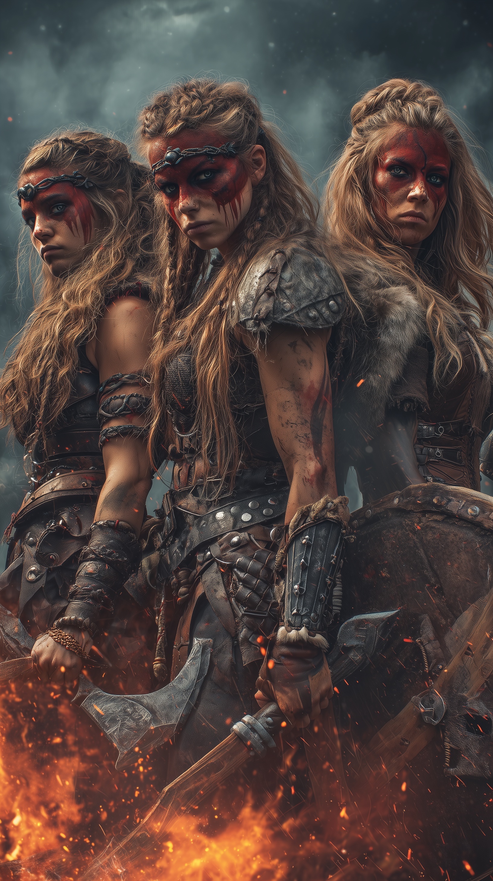
The before was a Viking portrait with one orange wash and no depth. The after used a 4300K differential: 3200K firelight behind the warriors against 7500K storm clouds. That single number changed the image from flat fantasy art to a book-cover scene with separation. The warm rim carved shoulders and braids out of the dark, while the cool background pushed the figure forward. It looked less like a filter and more like weather.
I got there by naming temperatures instead of moods. “Dramatic firelight” gives the model no physical constraint, so it defaults to a global orange tint that flattens skin texture. Firelight sits around 1800K–3200K; overcast daylight sits around 6500K–7500K. When both are specified, the model must decide which pixels belong to each source. That decision is what creates spatial separation. The Viking prompt works because the contrast is built into the lighting math.
Lower differentials drift toward neutral because the AI reads the gap as white-balance error. Specify 4000K and 5000K, and it averages near 4500K, killing the separation. The reliable threshold for warm-cool rendering sits around 2500K–3000K of separation. Below that, you get mush. Above it, shadows can go blue-black while highlights clip. The 3200K/7500K split lands in the useful range for fantasy character prompts because it is dramatic without looking broken.
The same fix applies beyond firelight. Neon against tungsten, candle against moonlight, screen glow against window light — all improve when you give the model explicit Kelvin values. It treats them as physical constraints rather than style suggestions. That is the real before/after: not more detail, but a lighting relationship the model can solve. For Viking covers, the result is a warrior who feels lit by a world instead of pasted onto a background.
Material Specification vs. Aesthetic Description
There is a fundamental difference between describing what something looks like and describing what it is. "Dark armor" is an aesthetic description. "Dark boiled leather base with riveted iron plates oxidized at edges" is a material specification. The first produces a generic dark shape. The second produces edge-level detail where oxidation actually accumulates in physical reality.
This matters because diffusion models are trained on photographs of real objects. When you name the manufacturing process — boiled leather, hand-forged iron, riveted plates — you activate training data associated with those processes. Hand-forged iron has visible hammer marks, uneven surfaces, and specific specular behavior. Riveted plates have stress points at the rivets where oxidation concentrates. Boiled leather has a hardened, slightly glossy surface that catches rim light differently than suede or rawhide.
The wolf pelt specification is particularly effective: "guard hairs catching light" tells the model to render individual hair strands at the silhouette edge, which is where backlighting produces the strongest rim separation. Without this, fur renders as a soft texture mass. With it, you get the spiky, backlit halo that reads as genuine animal fur rather than a texture map.
The same logic applies to the weapons. "Double-bitted battle axe with worn oak handle showing palm wear" specifies not just the object but its usage history. Palm wear is a specific pattern of polished wood where hands have gripped repeatedly — it catches light differently than the surrounding grain. This level of specificity is what separates a prop from a narrative object. The Frankenstein's Monster prompt uses identical material logic for stitched skin and surgical iron.
Camera Signatures and Optical Realism
Specifying "ARRI Alexa 65 with Zeiss Master Prime 85mm" is not name-dropping. It is a constraint system. The Alexa 65 has a medium format sensor that produces specific depth characteristics — shallower falloff than full-frame, with smoother transition between in-focus and out-of-focus areas. The Zeiss Master Prime 85mm has high micro-contrast and minimal chromatic aberration, which translates to crisp skin texture without color fringing.
When you omit camera specifications, the model defaults to a generic "cinematic" rendering that typically includes a teal-orange grade, excessive lens flare, and plastic skin. The camera signature overrides these defaults by anchoring the render to a specific optical system with known behavior.
The f/2.8 specification is equally important. At f/2.8 on an 85mm lens, the depth of field at portrait distance is approximately 15–20cm. This means the central warrior's face is sharp while the flanking figures and background haze fall into progressive softness. This is not just aesthetic — it creates the visual hierarchy that book cover designers need. The sharp subject occupies the upper two-thirds, leaving the lower third for typography overlay. The edgy religious horror prompt uses the same depth-of-field strategy for title placement.
Subsurface scattering deserves specific attention here. When you write "subsurface scattering at thin areas," you are telling the model that light should penetrate thin tissue — ear rims, nostril edges, the webbing between fingers — and re-emit with a red shift. This is the difference between skin that looks like a painted surface and skin that looks like a living membrane. Combined with pore specification and embedded grime at the hairline, you get the full stack of skin realism: micro-texture at the surface, light penetration beneath it, and environmental accumulation at the edges.
Composition Logic for Group Portraits
The original prompt specifies "three shieldmaidens in tight formation" with "medium close-up framing from mid-chest." This is a tension that needs resolving. Three figures in tight formation at mid-chest framing means the central figure dominates the frame while the flanking figures are partially cropped. This is actually correct for the intended use — a book cover needs a clear focal point, not an evenly distributed group.
The 9:16 aspect ratio is non-negotiable for book covers and vertical promotional assets. It forces the model to stack the composition vertically, which naturally places the fire in the lower third, the faces in the upper two-thirds, and the storm clouds at the top. This is the classic cover layout: threat below, heroes in the middle, atmosphere above.
The "layered formation" detail is what prevents the three figures from reading as a flat row. Layering means one figure slightly forward, one slightly back, creating occlusion and depth. The central warrior with the axe is forward; the shield-bearers are offset. This is the same compositional principle used in the hyper-realistic collage workflow, where overlapping elements create spatial depth without requiring complex camera movement.
For readers looking to experiment with these principles, Midjourney handles the --style raw parameter with the most consistent results for this type of physical specification. Leonardo.ai offers alternative rendering pipelines that respond well to the same material and camera constraints, though with slightly different color science defaults.
Conclusion: From Prompt to Production Pipeline
The technical framework here — Kelvin differentials, material specification, camera signatures, and composition logic — is portable. It works for any character portrait where you need physical realism and narrative depth. The next step is to test these principles against different lighting scenarios: replace the fire with bioluminescence, the storm clouds with cave darkness, the iron armor with bronze or bone. Each substitution forces you to re-specify the Kelvin temperature, material process, and camera behavior, which is exactly how you build a reusable technical vocabulary for AI image generation.
Key Principle: Replace quality adjectives with physical specifications: Kelvin temperatures, material processes, and camera signatures. The model renders what you describe physically, not what you evaluate aesthetically. If you want to go deeper, read generate stunning textured geometric.