
The Warm Lighting Mistake That Ruined My Floral Wallpaper
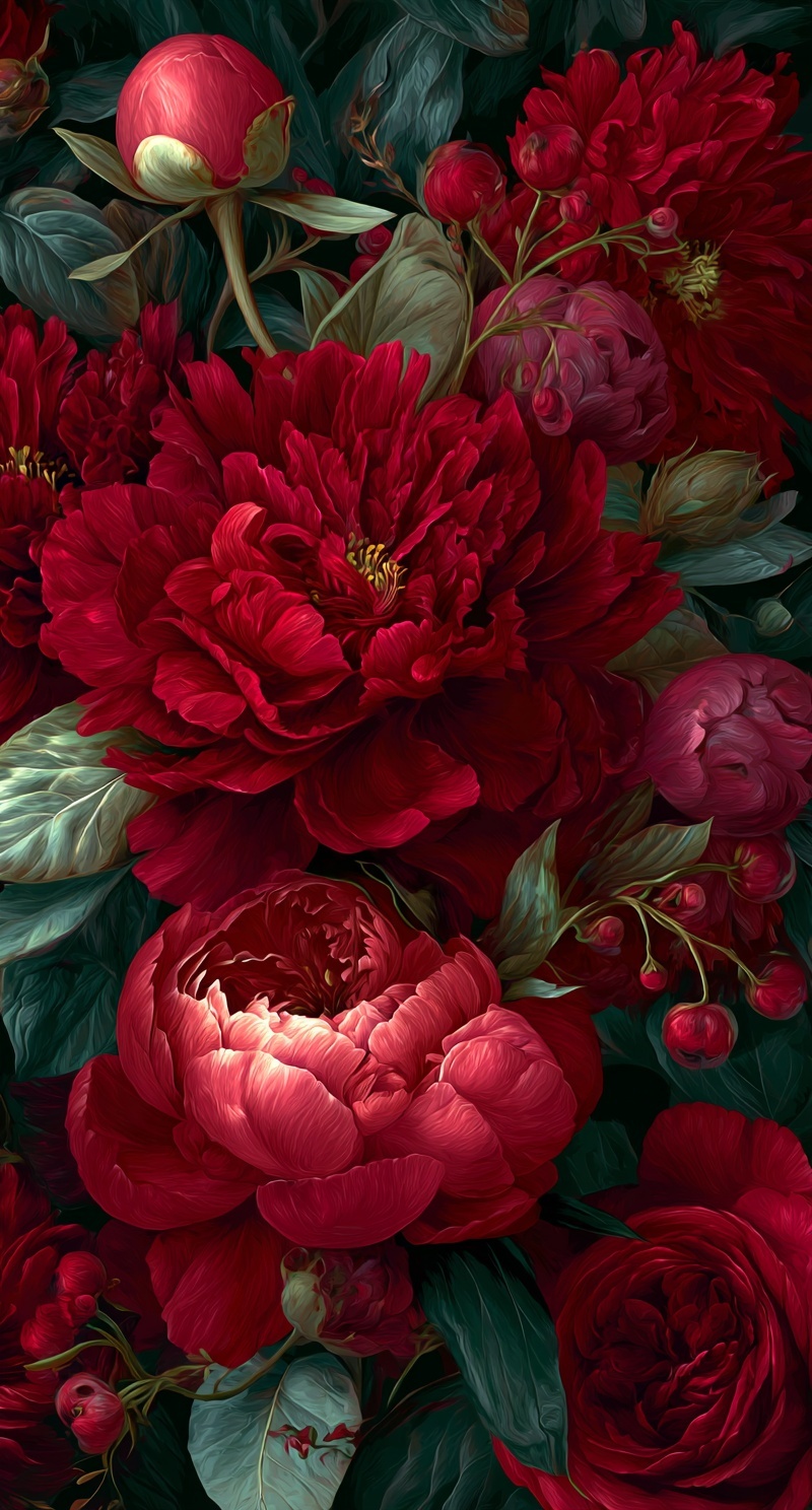
Quick Tip: Copy the prompt with the button above — paste it into Midjourney as-is (--ar and --style raw included). On DALL-E, Flux, Stable Diffusion, Ideogram, Leonardo AI or Firefly, keep the descriptive text and drop the -- flags. Render at the widest ratio you need first, then crop down: stretching a square background sideways breaks perspective.
Most floral wallpaper prompts fail for the same reason: they describe a picture instead of a system. A picture has a subject, a background, and a focal point. A wallpaper has none of those — it has a continuous field that must hold attention at every coordinate without demanding it at any single one. The prompt above works because every clause is doing structural work, not decorative work. Here is what is actually happening under the hood.
Why Kelvin Differentials Beat 'Warm Lighting'
My first floral wallpaper test looked like a pumpkin spice ad. I had typed “warm dramatic lighting” and the model washed every dark green leaf in orange. The petals lost their edges, the background turned muddy, and the whole thing felt like a filter instead of a scene. That was the day I stopped treating warm lighting as a usable instruction. It describes a feeling, not a source, and the model guesses wrong almost every time.
Then I tried two temperatures: 3200K for the rim light and 6500K for the shadowed background. The difference was immediate. The model had to solve a relationship, not apply a tint. It kept the foliage green because the cool ambient had a defined role, while the warm rim stayed on the petal edges. The floral wallpaper stopped looking painted by one bulb and started looking lit by a room.
The mistake I see most often is splitting the difference. A 4000K fill against 5500K background reads as white-balance error, so the model neutralizes both toward gray. Push past 4000K of separation and shadows go blue-black while highlights clip orange. The 3200K/6500K gap works because it is large enough to signal intent and small enough to stay believable. If your floral wallpaper looks flat, check the Kelvin gap before you add more adjectives.
Hex Codes as Constraint Systems
Color names are lossy compression. "Burgundy" spans at least four distinguishable hues — oxblood, maroon, wine, and garnet — and each model has a different internal centroid for the word. When you write "burgundy, scarlet, forest green, and cream" in a single prompt, you are handing the model four fuzzy targets and hoping it picks the right region of each.
Hex codes eliminate the guess. #722F37 is not a range; it is a point. The model's tokenizer treats it as a numeric constraint that anchors the palette's chroma channel. When four hex values are provided, the model tends to build the entire image inside the convex hull of those points — which is why the result reads as a coherent jewel-tone system rather than a bouquet of unrelated flowers.
The practical consequence: the greens in the prompt hold their saturation instead of drifting toward yellow-green, and the crimson petals stay on the blue side of red instead of sliding toward orange. If you have ever generated a floral image where the roses looked almost neon and the leaves looked dusty, that is a palette-hull failure — the model was interpolating between vague color words and landed outside the intended range. The same anchoring logic appears in collage composition prompts, where a fixed palette is what keeps disparate elements reading as one image.
Building Depth in a Flat Pattern
A dense floral field has a structural problem: everything sits on the same plane. Peonies, roses, leaves, buds — if they all render with the same level of detail and the same contrast range, the image flattens into a textile print. It looks busy without looking deep.
The fix is aerial perspective, borrowed from landscape painting. In a real landscape, distant mountains lose contrast and shift toward the ambient color because atmosphere scatters light between the viewer and the subject. Applied to a bouquet, the same principle means the "lower planes" — the flowers conceptually further back — should render with softer edges, lower contrast, and a slight tint toward the shadow temperature.
The prompt specifies this explicitly: "soft atmospheric depth through aerial perspective in lower planes." That instruction tells the model to modulate edge sharpness across the composition, not just across a depth-of-field blur. The result is a field where some blooms read as foreground and others recede, without any of them becoming a focal subject. This is what makes the pattern feel like it has volume instead of reading as a flat sticker sheet.
The Brushstroke Problem
"Painterly" is one of the most abused words in image prompting. On its own, it triggers a stock-art filter that overlays visible strokes on top of a smooth render — you can tell because the strokes ignore the underlying form. They run across petals instead of along them.
Specifying "directional brushwork following petal curvature" forces a different computation. The model now has to derive stroke orientation from the geometry of each surface. Strokes on a rounded peony center radiate outward; strokes on a folded petal edge follow the fold line. That is what real oil painters do, and it is what separates a painterly render from a painterly filter.
Pair this with "rich impasto strokes on flower centers" and you get a second layer of information: the model knows that thickness should concentrate where the form is most complex. Impasto is not uniform — it builds where the painter needed to describe a difficult shape. Directing it to the centers rather than the edges is what gives the blooms their tactile weight. If you want to see the same principle applied to a different surface, the puzzle-piece portrait technique uses the same form-following logic for edge geometry.
If you are generating this in Midjourney, the --style raw flag is non-optional here. Without it, the model applies its default aesthetic polish — boosted contrast, saturated midtones, a slight vignette — which fights the chiaroscuro you just spent the prompt building. The Midjourney documentation covers the flag's behavior, and it is worth understanding before you tune the Kelvin values, because raw mode changes how the model interprets temperature contrast. For a different rendering pipeline that handles painterly texture with more explicit control, Adobe Firefly exposes texture and stroke parameters that Midjourney keeps implicit.
Where to Take This Next
Once the base pattern is stable, the natural next move is to stress-test the composition at different aspect ratios. A 9:16 tile that reads well at wallpaper scale may fall apart at 1:1 — the flowers that carried the vertical rhythm become unbalanced when cropped square. Regenerate at --ar 1:1 using the same seed and compare where the density drops. The prompts that survive both ratios are the ones you can actually ship as a wallpaper set. From there, the same structural vocabulary — dual Kelvin, hex hull, form-following strokes — transfers directly to textile patterns, book covers, and any surface where the image has to work without a subject.
Key Principle: Never let one color name carry a whole palette. Anchor every hue with a hex code and every light source with a Kelvin value — the model then has numerical constraints instead of adjectives to guess from. If you want to go deeper, read tim burton style stop motion character.