
Pop Art Cat Portraits: Stop Lighting the Whole Scene
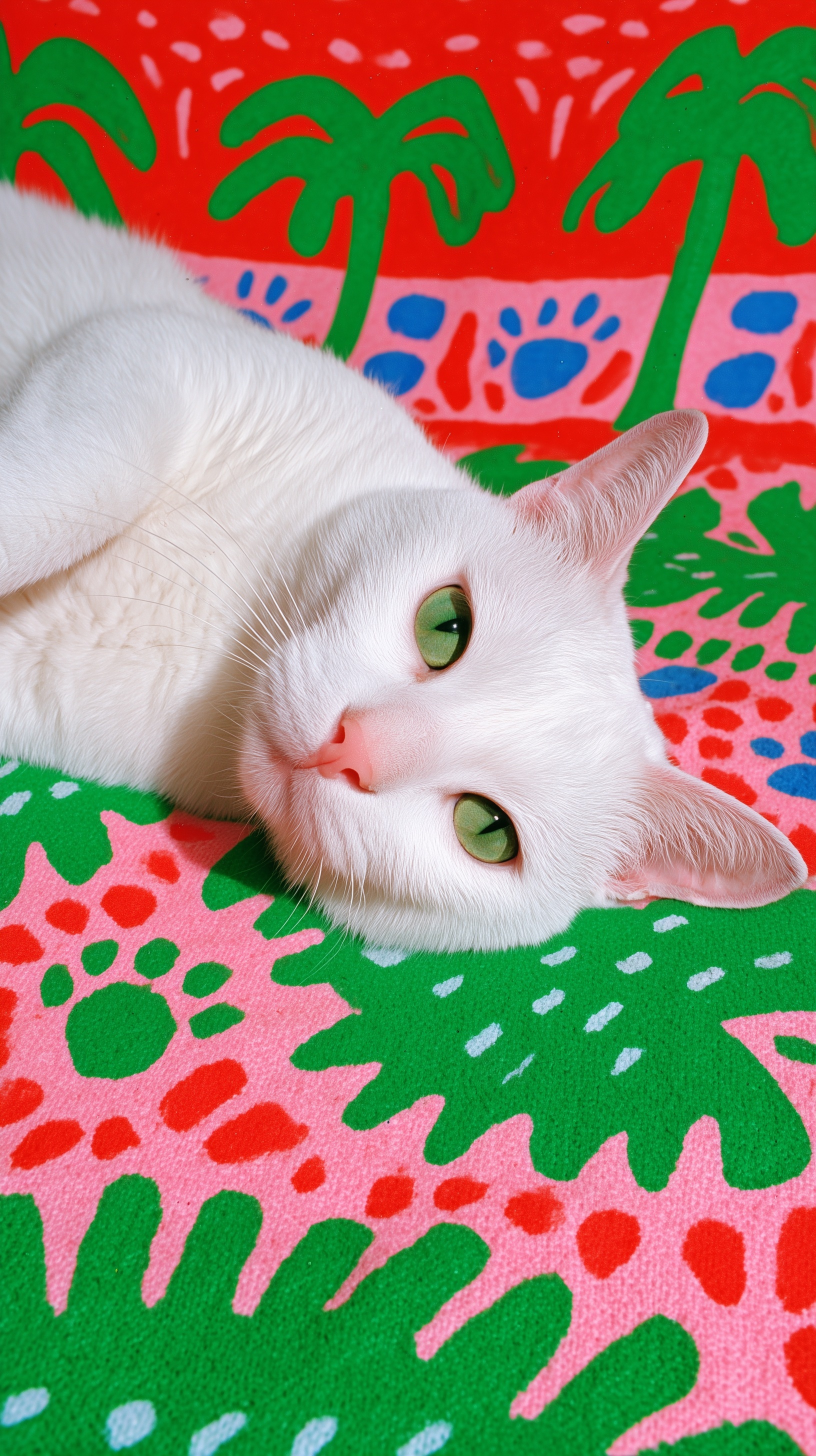
Extreme close-up portrait of a pristine white cat with luminous chartreuse-green eyes and a soft pink nose, head tilted 15 degrees, direct gaze with alert curiosity, whiskers catching the key light. Subject lighting: single hard direct flash from camera-left at 45 degrees, crisp specular highlights on individual fur strands, defined shadow falloff on the right side of the face only, hyper-detailed strands with subtle cream undertones at root and tip, visible guard hairs and dense undercoat, subsurface scattering on the ears. Backdrop lighting, described separately: woven textile backdrop lit evenly and diffusely, shadowless and flat, oversized stylized palm tree silhouettes in electric green against a saturated coral-red field, interspersed paw print motifs in cobalt blue and hot magenta, visible fabric weave texture with slight irregularity, contact shadow only beneath the jaw where the head meets the fabric. Color palette: maximum saturation clash of warm coral against cool green. Mood: irreverent, energetic, graphic impact. Shot on Hasselblad X2D, 120mm macro at f/8, shallow depth of field isolating the face from the background. 8K, photorealistic fur simulation, chromatic aberration limited to background edges. --ar 9:16 --style raw --s 150
Quick Tip: Click the prompt box above to select it, then press Ctrl+C (Cmd+C on Mac) to copy. Paste directly into Midjourney, DALL-E, or Stable Diffusion and customize to make it your own!
The text encoder does not read a prompt left to right the way a person reads a sentence. It splits the string into token groups, embeds each group, and the cross-attention layers weight the earliest groups most heavily while the latent is still mostly noise. That is why "extreme close-up portrait of a pristine white cat" behaves like a contract: it fixes subject, framing and species before a single lighting word is parsed. Everything after it — flash angle, shadow falloff, backdrop weave — is a modifier applied to a composition that already exists. Lighting tokens never build the scene; they adjust it.
Once that is understood, the lighting decision stops being a taste question and becomes an attention-budget question. A token that says "lit evenly and diffusely" competes with a token that says "single hard direct flash" for the same region of the latent. The model does not arbitrate between them; it averages. The practical consequence is that you cannot light a subject and its backdrop with two contradictory instructions unless you scope each instruction to a different part of the frame. Three approaches do that scoping in different ways, and each leaves a different fingerprint on the render.
Approach One: Light the Whole Scene Evenly
The first approach describes one light for everything: soft, diffuse, shadowless, even exposure across the frame. Its visible signature is a low-contrast image where the cat and the textile sit on the same luminance plane. Fur strands merge into a soft mass, guard hairs stop resolving individually, and the background pattern stays perfectly legible because nothing is casting directional shadow onto it. Nothing clips. Nothing blows out. The trade-off is separation: a white cat on a pale pink field at identical exposure loses its silhouette, and the muzzle and ear edges dissolve into the print.
The token behaviour behind that failure is worth naming. Phrases like "soft diffused light from all directions" and "no visible shadow" describe luminance without assigning it to an object. The model applies them globally, so the micro-contrast that makes white fur readable against a light background never gets generated. Pop art depends on graphic separation — flat field, dimensional subject — and uniform lighting removes exactly the contrast that produces it. The result reads as a sticker sheet rather than a portrait.
This approach still has a legitimate use. When the backdrop motifs are the subject of the image and the animal is a prop, flat lighting preserves every printed detail and keeps the palette saturated without risk of clipping. It pairs well with deliberately graphic, illustration-adjacent treatments such as the ones in this cubist Marilyn Monroe prompt breakdown, where flat colour fields are the point rather than an accident.
Approach Two: One Hard Key on the Subject Only
The second approach gives the subject a single hard direct flash from camera-left at 45 degrees and leaves the backdrop alone. Its signature is micro-contrast: individual fur strands resolve, specular highlights sit on the tips of guard hairs, and shadow falls off across the right side of the face only. The backdrop stays flat and shadowless, so the palm silhouettes read as printed shapes rather than lit objects. This is the configuration the original prompt was built around, and it produces the most dimensional cat against the flattest possible field.
The mechanism that keeps the two regimes apart is the scoping word. "On the right side of the face only" and "where the head meets the fabric" tell the model that the hard key has a boundary. Remove that boundary and the flash token bleeds onto the backdrop: palm silhouettes acquire directional shading, the coral field develops a gradient, and the graphic flatness that makes the composition work disappears. Spatial qualifiers are not decoration here; they are the load-bearing part of the sentence.
The trade-off is clipping risk. Hard flash on white fur at f/8 can push highlights past the top of the range, and the model may invent a blown patch on the brow or the bridge of the nose where no texture survives. Subsurface scattering on the ears compounds this, producing a pink translucency that reads as an artifact rather than anatomy. Keeping "subtle cream undertones at root and tip" in the prompt gives the highlight somewhere to travel, which is the same reasoning behind the tonal control in this neo-expressionist portrait workflow.
Approach Three: Hard Key Plus a Second Exposure for the Backdrop
The third approach splits the prompt into two explicit lighting sentences: one for the subject, one for the backdrop. The subject keeps the hard flash; the backdrop gets its own description — "lit evenly and diffusely, shadowless and flat, visible fabric weave texture with slight irregularity". The signature is a subject that pops against a field that looks screen-printed, with the weave resolving as texture rather than as shading. This is the configuration that survives the most scrutiny, because neither lighting regime has to compromise for the other.
There is a non-obvious parameter interaction here that most tutorials skip. Depth-of-field tokens and background-detail tokens fight each other. "120mm macro at f/8, shallow depth of field isolating the face" asks for background blur; "visible fabric weave texture" asks for background resolution. The model resolves the contradiction by rendering weave detail only near the frame corners, which produces a fake tilt-shift look. The fix is to name where the weave should be visible instead of asking for it globally.
A related trade-off sits in "chromatic aberration limited to background edges". That phrase pushes the renderer to treat the backdrop with lower optical fidelity, which reads as cheap print registration — exactly right for pop art, wrong for premium editorial. Choosing it is a judgment call about which register the image belongs to, not a quality setting. Comparing it against a cleaner fashion register, as in this mosaic fashion prompt study, makes the difference obvious in one side-by-side.
Where Each Approach Breaks
Uniform lighting breaks on white-on-pale subjects, where equal exposure erases the silhouette. Hard key breaks on clipping and on bleed, unless the scoping word is present. The hybrid breaks on token budget: long prompts dilute attention, and past roughly sixty to seventy tokens the later modifiers lose weight. When the backdrop sentence drifts too far down the string, the model starts treating it as optional and reverts to shading the palm silhouettes. Order matters as much as content, which is why subject tokens stay at the front in every version of this prompt.
Negative tokens deserve their own warning. A phrase like "--no shadow on background" is embedded much like a positive one, which means it introduces the concepts "shadow" and "background" into the conditioning. In several model versions the practical effect is that contact shadow disappears entirely and the head appears to float above the textile. Phrasing the same intent positively — "shadowless flat backdrop", plus "contact shadow only beneath the jaw" — gives the renderer a target instead of a prohibition.
Model version still decides how much of this survives. Rewriting pipelines, such as the one documented for DALL·E 3, may paraphrase spatial scoping words away, while Midjourney and Adobe Firefly tend to honour structural tokens more literally. Test one variable per render: change the scoping phrase, hold everything else fixed, and compare the falloff. Without that discipline, you cannot tell whether a change came from your edit or from the sampler.
The principle compressing everything above: the model averages unscoped light tokens across the frame, so any lighting instruction that is not bound to a named region will contaminate the regions you wanted untouched. Scope the light, and the pop art flatness and the fur micro-detail stop competing.
Label: Cinematic
Key Principle: Scope every lighting instruction to a named region — "on the right side of the face only", "backdrop lit diffusely" — because an unscoped light token is averaged across the whole frame instead of being applied where you want it.