
How I Finally Fixed My Jester Playing Card Design
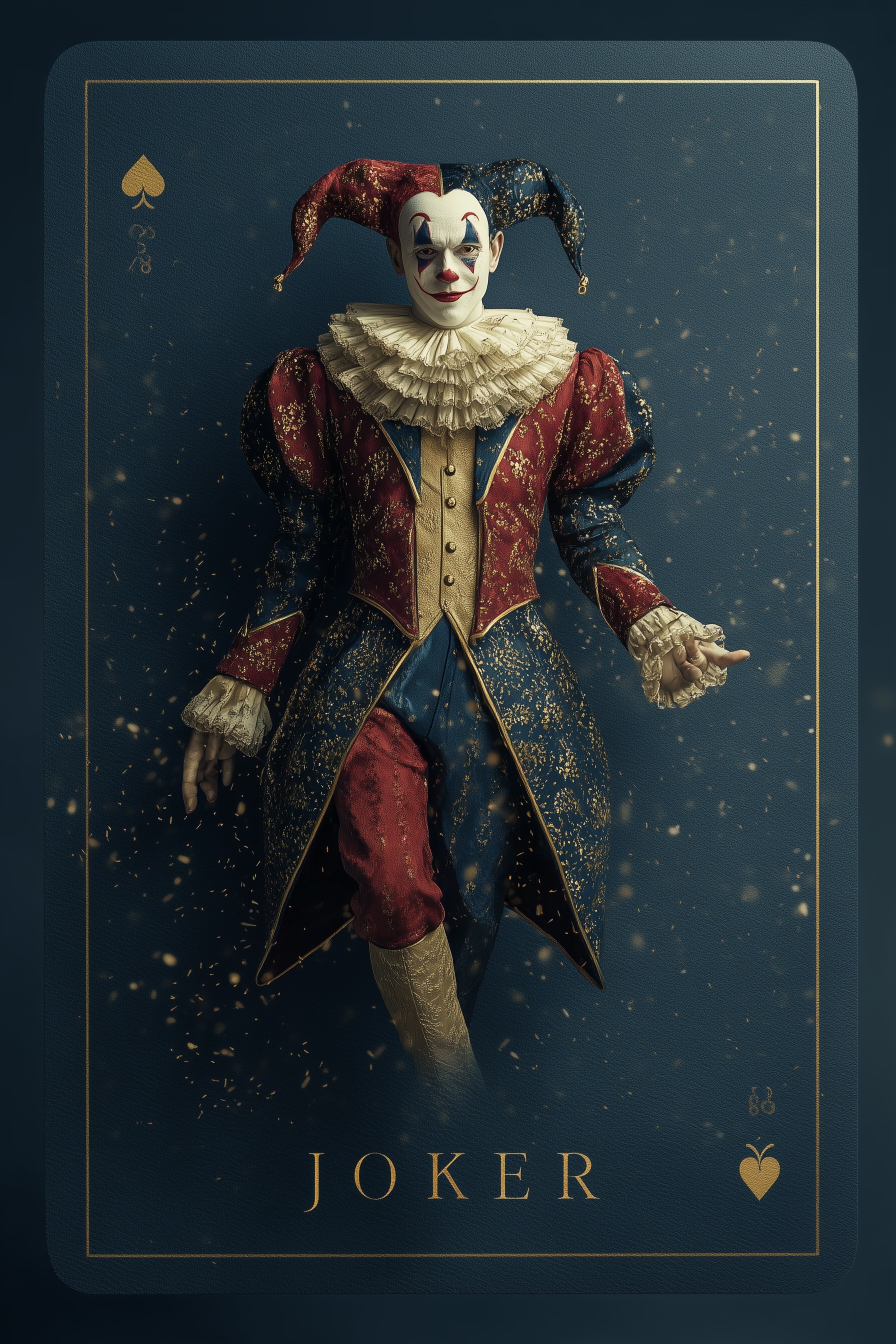
Quick Tip: Copy the prompt with the button above — paste it into Midjourney as-is (--ar and --style raw included). On DALL-E, Flux, Stable Diffusion, Ideogram, Leonardo AI or Firefly, keep the descriptive text and drop the -- flags. Start from the Kelvin value: change it first and watch how skin tone shifts before touching anything else.
The Card Has to Be Printed, Not Framed
I burned through a dozen jester playing card prompts before I admitted the problem wasn't the costume or the pose. Every render came back looking like a portrait with a decorative rectangle pasted behind it. The model read 'playing card background' as a compositing layer, not as a real object the jester was printed on. That flat, sticker-like result killed the whole illusion. The turning point came when I stopped describing the card as decoration and started describing it as a manufactured thing with a surface, edges, and thickness.
Once I switched to printing vocabulary, the image changed fast. 'Deep navy textured linen card stock' gave the surface a visible grain. 'Thin double gold foil border' suggested a stamped metallic line with tiny imperfections and a soft reflection. 'Embossed golden spade' made the symbol feel raised, so light caught one edge and dropped shadow on the other. Those phrases aren't aesthetic garnish; they tell the model how the material behaves. The card stopped floating behind the jester and started feeling like something held in a hand.
This is the same lesson that separates a believable luxury gold render from cheap yellow plastic. You have to name materials by their physical behavior, not by the vibe you want. A card isn't an ornate frame. It's paper, foil, ink, and embossing with weight and texture. When I prompt it that way, the jester finally looks printed onto a real object instead of pasted over a background. That shift made my designs feel less like AI output and more like a photographed piece of cardistry gear.
Why Two Kelvin Temperatures Beat "Dramatic Lighting"
The original prompt's lighting block — 3200K key from upper left at 45 degrees, 6500K rim from behind the right shoulder — is doing more work than any other line in the prompt, and it's worth understanding exactly why.
A jester inside a navy card presents a specific separation problem: the costume's midnight-blue side is nearly the same hue and value as the card stock. Under a single light source, that half of the figure dissolves into the background. The cool 6500K rim light solves this by drawing a bright edge along the shoulder, hat peak, and sleeve on the shadow side — a literal outline of light that re-establishes the silhouette. Meanwhile the warm 3200K key models the face, the burgundy velvet, and the gold embroidery with tungsten warmth that reads as theatrical and intimate.
The roughly 3300K differential between the two sources is also significant. A gap this large is unambiguous: the model reads it as intentional mixed lighting, a hallmark of stage and studio photography. Smaller gaps — say 4300K against 5500K — tend to get averaged out, because the model interprets near-identical temperatures as a white balance inconsistency and "corrects" toward neutral. If you want warm-cool contrast, commit to it. This same dual-temperature logic drives the mood in pieces like the ultra-realistic Joker portrait, where a cold rim against warm skin is what produces the unsettling theatrical tension.
"Dramatic lighting," by contrast, contains no direction, no temperature, and no ratio. Models resolve it to the statistically average version of drama: slightly darkened edges and a frontal source. That's why prompts heavy on mood words and light on physics produce interchangeable results.
Fabric Language: Pile, Thread, and Specularity
The split-tone costume is the design's signature, and it's where vague prompts quietly fail. "Red and blue jester costume" produces flat color blocking. "Deep burgundy velvet with antique gold bullion embroidery" produces a material.
Velvet is a directional fabric: its pile reflects light differently depending on the angle between the fibers, the light source, and the camera. Including the word "pile" or "velvet texture catching directional light" pushes the model to render those characteristic bright-and-dark shifts across folds, which is what makes velvet read as velvet rather than matte red cloth. Similarly, "bullion embroidery" and "woven metallic thread" specify raised metal with specular highlights — the model renders small bright points along the embroidery lines instead of painting flat gold shapes.
The face paint benefits from the same specificity. "Porcelain white face paint with cracked matte texture" gives the surface a finish (matte) and a condition (cracked), which distinguishes painted skin from bare skin. Without that, you often get an unpainted face with red and blue accents — technically a jester, but missing the unsettling porcelain-mask quality that defines the archetype. For a grittier, street-level take on painted-face characterization, the street Joker portrait prompt shows how surface-condition language changes the entire register of a character study.
Typography: Less Text, Rendered Better
Playing card prompts invite a predictable mistake: requesting the full visual system of a real card — corner indices, suit symbols in two corners, a title, decorative microtext. Every text element in a prompt competes for the model's rendering budget, and letterforms are among the hardest things for image models to produce cleanly. Three text elements means three opportunities for garbled output, and garbled text is the fastest way to make a card design look broken.
The disciplined approach is one primary title ("JOKER" in gold serif at bottom center) plus one small corner label, with suit symbols doing the rest of the communicative work. Symbols render far more reliably than words because they're simple geometric shapes. If you need perfect typography for a finished product, generate the card art with minimal text and add the type in post — tools like Adobe Firefly integrate with layouts where vector text stays crisp, which no diffusion model can guarantee.
It's also worth noting that different generators handle in-image text very differently. Midjourney with --style raw and short text strings performs respectably on single words like "JOKER," but longer phrases degrade quickly regardless of platform. Design your composition around that constraint rather than fighting it.
Where to Take This Next
Once the physical-card illusion and dual-temperature lighting are working, the natural next experiments are variations on the container: an aged, worn card with creases and foxing; a full court set (King, Queen, Jack) sharing one lighting and material system for consistency; or a tarot-style card where the border ornamentation becomes more elaborate and the typography more central. Each variation tests a different part of the prompt architecture — material aging, cross-image consistency, or text-heavy composition — and the principles above (physical print vocabulary, committed Kelvin contrast, fabric-level material language, restrained typography) transfer directly.
Key Principle: Treat the playing card as a physical printed object — name its card stock, foil, and embossing — and light the figure with two specified Kelvin temperatures so the subject separates from the navy card instead of merging with it. If you want to go deeper, read my go to ai matchstick art tips after.