
How I Fixed My Impasto Kingfisher Wall Art Prompt
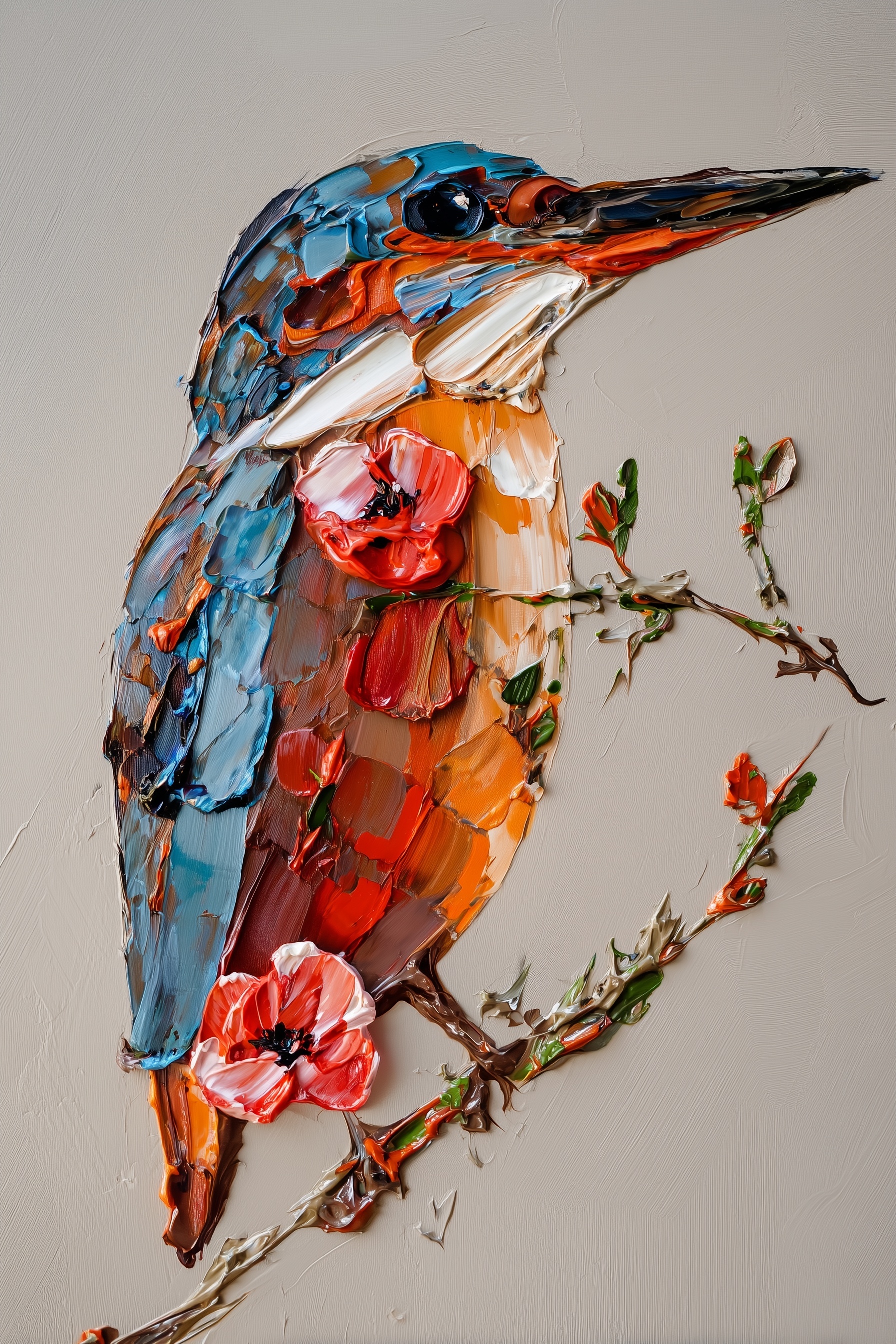
Extreme close-up kingfisher portrait, side profile facing right, perched on a weathered branch with sculptural crimson poppy blossoms. Heavy impasto oil technique applied with a palette knife, paint ridges standing 4–5mm proud of the canvas surface, each stroke a discrete physical deposit with visible knife-edge terminations rather than a blended mark. Distinct broken color passages: adjacent strokes of cobalt blue and cerulean remain unblended, their edges meeting in hard ridges that cast their own micro-shadows. Cobalt blue crown with ultramarine shadows transitioning to cerulean nape; burnt sienna throat warming to cadmium orange breast; ivory cheek patches with raw umber shadowing; vermillion poppies with ivory-edged petals and carbon black stamens; olive stems with viridian highlights and burnt umber shadows. Warm greige background with visible linen weave texture and subtle horizontal brush marks, the weave catching light in shallow relief. Single directional light source from upper left at 45 degrees, casting hard cast shadows from paint ridges and producing specular highlights on raised impasto peaks; the paint surface reads as wet and dimensional, not flat, with no soft studio fill light. Museum acquisition quality, 8K detail on Belgian linen canvas texture, paint catching virtual light with measurable depth. --ar 2:3 --v 6 --style raw --s 750
Quick Tip: Click the prompt box above to select it, then press Ctrl+C (Cmd+C on Mac) to copy. Paste directly into Midjourney, DALL-E, or Stable Diffusion and customize to make it your own!
Adding "highly detailed, ultra textured oil painting" to an impasto prompt reliably produces a smoother, flatter image than writing nothing at all. The expectation is that more detail vocabulary yields more visible paint. The outcome is the reverse: detail tokens push the model toward resolving every pixel into a continuous gradient, and a continuous gradient is the exact opposite of a palette-knife deposit. Impasto is defined by discontinuity — a ridge that ends abruptly, a stroke that refuses to blend into its neighbour — so the vocabulary that improves a photoreal portrait actively destroys a painted one.
The conflict is structural rather than stylistic. A kingfisher needs fine resolution at the eye, the beak seam, and the ivory cheek patch, but those same tokens propagate across the whole frame and smooth the paint body into a single continuous surface. Repairing the prompt therefore means separating two competing demands: optical detail where the subject requires it, and hard-edged physical relief everywhere else.
Why Texture Adjectives Collapse Into Smooth Shading
Words like "thick paint," "textured," and "heavy impasto" are category labels, not geometry. A diffusion model has no measurement to attach to them, so it averages them against its training prior, which is dominated by gallery photographs of paintings lit with soft, even fill light. That prior resolves the request into a smooth surface with painted-looking colour, not a surface with actual height. The prompt says impasto; the render says printed canvas.
The correction is to replace adjectives with measurable geometry: ridges standing 4–5mm proud of the surface, discrete deposits, knife-edge terminations, hard ridges where two strokes meet. Pair that with a low-aesthetic-smoothing setting — Midjourney's --style raw at a stylize value around 750 keeps the paint reading as paint instead of drifting into illustration gloss.
Approach A — Millimetre-Depth Texture Phrasing
This approach front-loads physical measurement. The prompt states the ridge height, names the tool (palette knife), and specifies that each stroke is a discrete deposit rather than a blended mark. Its visible signature is specular highlight on the raised peaks and a thin cast shadow running down the shadow side of every ridge, which is what makes the surface read as dimensional under a single light source.
The trade-off is drift toward a sculpted or clay-render look. When ridge language is stacked without a canvas reference, the model forgets the substrate and the whole image becomes three-dimensional relief with no linen underneath. The fix is to keep the linen weave sentence intact and to avoid words like "sculpted," "carved," and "3D." The same discipline applies to any heavy-surface treatment, including the crackle-and-relief logic used in cracked canvas sports portraits.
Before moving on, zoom to 100% and inspect a single ridge edge. If it terminates in a dark line or a shadow, the depth phrasing worked. If it fades into a gradient, the model has blended it and the ridge language needs to be more explicit.
Approach B — Named Pigment Adjacency Lists
Instead of describing texture, this approach describes chemistry. It names the pigments and, critically, the pairs that must not merge: cobalt blue against cerulean, ultramarine in the crown shadows, burnt sienna warming into cadmium orange, vermillion petals edged in ivory. The visible signature is broken colour — a faceted, mosaic-like surface where each stroke holds a single hue and the boundary between two hues is a hard ridge rather than a transition.
The mechanism is adjacency. Diffusion models blend neighbouring tokens by default, so naming two pigments in the same clause invites a gradient between them. Naming them as an unblended pair, with the ridge described as the meeting point, forces the boundary to stay sharp. That is the same principle behind hyper-realistic collage prompts, where hard material edges carry the realism.
The failure mode is over-listing. Beyond roughly five pigment pairs, the model assigns each named colour to its own region and the bird dissolves into a patchwork of flat swatches with no underlying form. Cap the palette, keep the anatomical clauses separate, and check the result with a squint test: if the kingfisher still reads as a bird at thumbnail size, the colour list is doing its job.
Approach C — Raking Light and Cast-Shadow Verbs
Impasto is only legible through shadow. Without a stated light vector, the model defaults to soft frontal studio lighting, which fills every ridge and erases the relief the other two approaches worked to build. This approach specifies a single directional source from upper left at 45 degrees, hard cast shadows thrown by the paint ridges, and specular highlights on the raised peaks.
The trade-off is that hard shadows across a face can swallow small features. On this subject, the ivory cheek patch and the dark eye sit in the same zone as the strongest cast shadow, so the prompt must also protect readability — "specular highlights on raised impasto peaks" keeps a glint on the eye while the surrounding paint stays in shadow. Renderers that expose separate lighting controls, such as Adobe Firefly, let you test the same prompt under different light models before committing.
Check this stage by looking for a consistent shadow direction across the bird, the branch, and the poppy petals. Inconsistent shadow angles mean the model has generated the elements independently and the light clause is not binding them.
Checklist Before Accepting the Render
Verify five things in seconds each. One: ridge edges terminate in shadow rather than fading into gradient. Two: at least one pigment boundary shows a hard unblended ridge — cobalt against cerulean is the easiest to spot. Three: the linen weave is visible in the greige background, confirming the substrate survived the relief language. Four: shadow direction is consistent across bird, branch, and blossom. Five: the eye and beak seam remain sharp despite the heavy surface.
If any item fails, change one clause only. Stacking fixes across texture, colour, and light simultaneously makes it impossible to tell which parameter produced the improvement, and the next render will drift somewhere new. Adjust, re-render, compare against the previous frame, and keep the version whose ridges hold their shadow at full zoom.
Label: Home
Key Principle: Impasto reads as physical only when the prompt states paint height in millimetres and forces unblended pigment edges to collide. Texture adjectives alone collapse into smooth, plastic shading.