
Realistic Dog Portraits Start With Fur Physics, Not Style
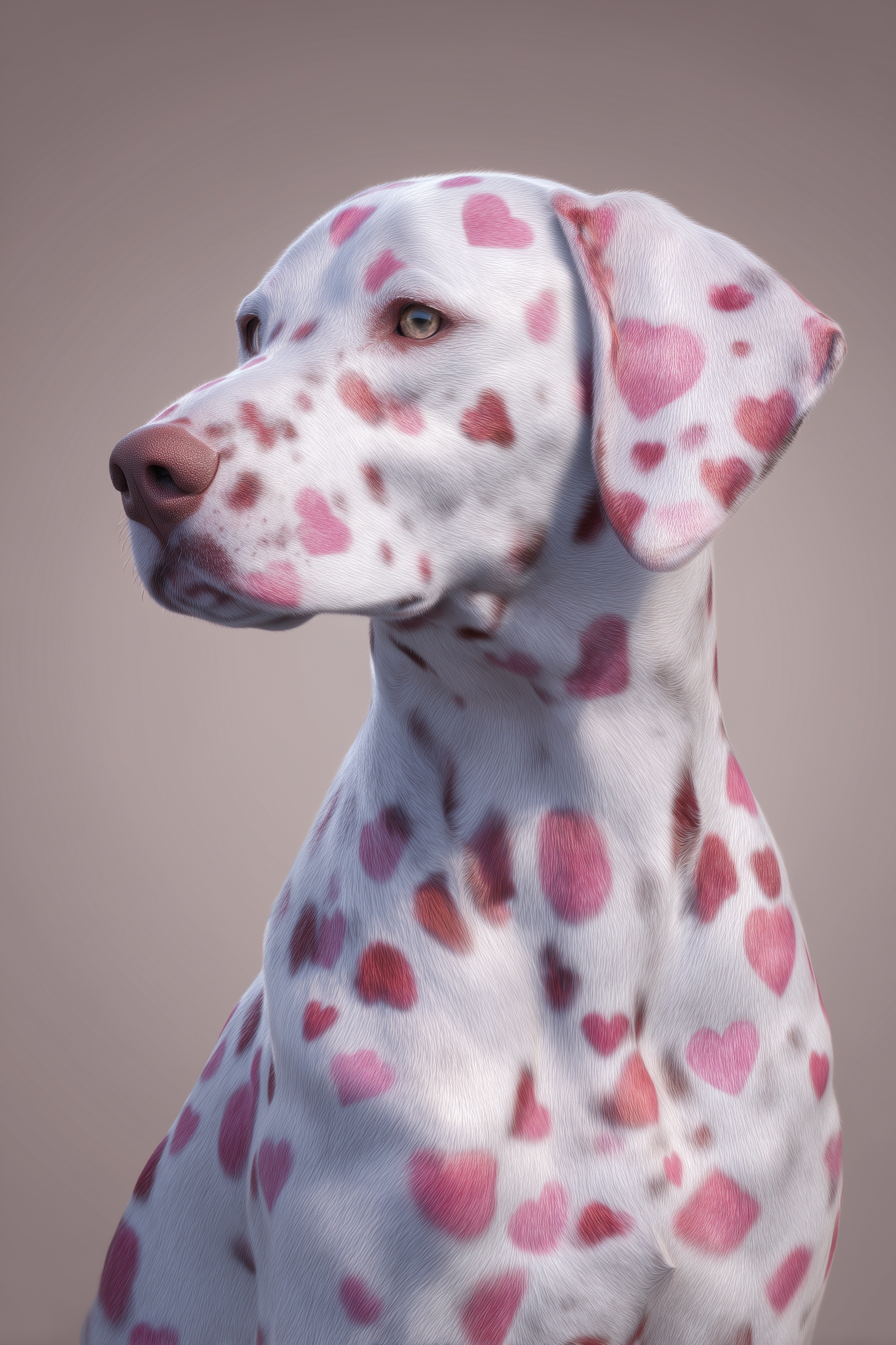
Quick Tip: Copy the prompt with the button above — paste it into Midjourney as-is (--ar and --style raw included). On DALL-E, Flux, Stable Diffusion, Ideogram, Leonardo AI or Firefly, keep the descriptive text and drop the -- flags. Start from the Kelvin value: change it first and watch how skin tone shifts before touching anything else.
Why 'Realistic Dog' Fails and 'Physical Fur Description' Succeeds
The dog has the face of a plush toy. Its eyes are glassy, its fur looks like molded plastic, and every Dalmatian spot sits in the same soft focus. That is what happens when a prompt says 'hyper-realistic Dalmatian' and stops there. The phrase tells the model what to draw, not what the surface does. It reaches for the average of every Dalmatian image tagged realistic, including retouched ads, digital paintings, and toy photography. The result is a portrait that reads as dog-shaped but not alive.
Diffusion models have seen millions of dogs. They have also seen millions of illustrations, cartoons, and AI-generated dogs. Style labels like 'realistic' or 'photographic' pull from that entire mixed distribution. They do not specify which physical cues make a photograph convincing. So the model gives you smooth gradients where fur should break into strands, and a nose that reflects nothing. The fix is to describe surface mechanics: short glossy fur with individual strands catching light, whisker detail that breaks the silhouette, a wet nose with a specular highlight from the key light.
Those details are events, not adjectives. A strand of fur catches light at a specific angle. A whisker interrupts the clean edge of the muzzle. A wet nose mirrors the studio softbox. When you describe the event, the model reaches for the training images where that event actually appears. It stops averaging style words and starts assembling a surface. That shift is why 'physical fur description' outperforms 'realistic dog' almost every time, especially in close-up portraits where texture carries the entire realism load.
For other portrait subjects, the same logic applies. Hyper-realistic character portraits depend on skin texture, pores, fine hair, and specular highlights, not on the word 'realistic.' The model cannot render what you do not specify. Give it the physical behavior of the surface, and it will choose the photographic branch of its training data. Leave it with a style label, and it will keep handing you plush toys with paws. The difference is not magic; it is the difference between naming a category and describing a material event.
Controlling Color Gradients: Hex Anchors vs. Adjective Ramps
Describing a color gradient with adjectives — "deep fuchsia, soft rose, dusty mauve, pale blush" — feels specific. It isn't. Each of those words maps to a wide band in the model's color space, and when you stack four of them in sequence, the model has to guess the interpolation curve. In practice, it guesses differently every generation. One run produces hot pink spots, the next produces muted mauve, the third produces something closer to salmon. The gradient is present, but it isn't controlled.
Hex values remove the ambiguity. #C2185B is a single point in sRGB. #E8A0B0 is another. When you provide four hex anchors in a gradient, the model has fixed endpoints and a defined path. The spots will still vary in placement across generations, but the palette holds steady. This is the difference between a prompt that produces one good image and a prompt that produces a consistent series.
There's a second mechanism at play: the model treats hex values as hard constraints because they appear in technical contexts in training data — design tools, CSS, color pickers. Adjective color names appear in marketing copy and casual description, which are softer contexts. The model's behavior follows the context. If you want a color held, speak the language of the tools that hold colors.
The same anchoring logic applies to material palettes in mosaic fashion work, where a defined tile palette is the difference between a coherent composition and visual noise.
The Lighting Setup That Separates Fur From Background
Most AI dog portraits fail at the lighting stage before the model ever touches the fur. The prompt says "studio lighting" or "soft light" and the model produces a flat, even wash — technically lit, but with no direction and no contrast. Flat light destroys fur texture because individual strands only become visible when light hits them at an angle. Frontal light illuminates every strand equally, which means none of them stand out.
The fix is to specify a two-light setup with an explicit contrast ratio. A soft diffused key from front-right at 45 degrees provides the primary modeling — it lights the muzzle, the brow, and the near cheek, while letting the far side fall into gentle shadow. A rim light from the left rear at roughly three-quarters the power of the key creates edge separation: the fur along the back of the neck and the far edge of the ear catches a thin line of light that lifts the subject off the background.
The fill ratio matters more than the light positions. A 3:1 ratio — key at three times the intensity of fill — produces a portrait with visible modeling but no harsh shadows. A 1:1 ratio flattens everything. An 8:1 ratio turns the portrait into a chiaroscuro study, which is wrong for commercial pet work. Stating "fill ratio 3:1" in the prompt gives the model a numeric target that it can map to its internal lighting model.
Background exposure is the second half of separation. Taupe #A89F91 alone doesn't tell the model how bright the background should be relative to the subject. Adding "background two stops darker than subject" establishes a luminance relationship. The white fur reads as bright because the background reads as dark. Without that relationship, the model often renders both at similar exposure and the dog dissolves into the wall.
If you want to see how directional light transforms a completely different subject, the grunge street art portrait breakdown shows the same principle applied to hard light and high contrast.
Lens Signature and Depth of Field as Realism Cues
The last layer of realism isn't in the subject — it's in the optics. A portrait shot at f/2.8 on an 85mm lens has a specific look: the ears fall slightly out of focus, the nose is tack sharp, the background is a smooth blur with no structure. That signature is what tells a viewer's brain "this was photographed." Without it, even a technically perfect render reads as a 3D model.
Stating "f/2.8" alone isn't enough. f/2.8 on a 24mm lens produces a very different depth of field than f/2.8 on an 85mm lens. The focal length determines the compression, the field of view, and the falloff pattern. When you write "85mm lens compression" alongside "f/2.8," the model pulls from training data tagged with both parameters and produces the correct optical signature.
Film grain is the final touch. "Subtle 35mm film grain" does two things: it adds micro-texture to flat areas like the background, and it signals to the model that the image should not be perfectly clean. Perfectly clean renders read as digital. Slightly grainy renders read as photographic. The grain is not decoration — it's a signal about the medium, and the model responds to it accordingly.
If you want to push this further, try running the same prompt with different focal length and aperture combinations — 135mm at f/2.0, 50mm at f/1.4, 85mm at f/4 — and compare the falloff patterns. Each combination produces a distinct optical signature, and the one that matches your reference photograph is the one that will read as real.
For tools to test these variations quickly, Midjourney and Leonardo.ai both handle parameter-heavy prompts well and let you iterate on lens and lighting changes without rebuilding the entire prompt each time.
Key Principle: Anchor every color claim with a hex value and every light claim with a direction plus a ratio. Adjectives describe intent; numbers describe results. If you want to go deeper, read the secret to ultra luxe ice grill.