
7 Matchstick AI Art Mistakes I Made (So You Don't Have To)
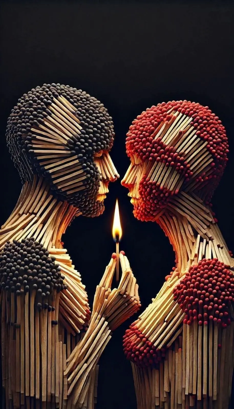
Quick Tip: Copy the prompt with the button above — paste it into Midjourney as-is (--ar and --style raw included). On DALL-E, Flux, Stable Diffusion, Ideogram, Leonardo AI or Firefly, keep the descriptive text and drop the -- flags. Try the same scene at two different aspect ratios: composition and light falloff change more than you'd expect.
Matchstick portraits look simple. Two figures, some sticks, one flame. But this category of AI image is one of the easiest to get subtly wrong — and the failures are instructive, because every mistake traces back to the same root cause: describing objects instead of systems. Here are the seven things that go wrong, and the mechanics behind each fix.
1. Letting the Model Decide Where the Head Colors Go
I burned through maybe thirty generations before I figured out what was going wrong. My prompt read something like "two figures made of matchsticks, one with black heads, one with red," and every result came back as a muddled salt-and-pepper scramble across both bodies. It took an embarrassing amount of trial and error to realize the model had no idea black belonged to the figure on the left. It only knew black and red existed somewhere in the frame, so it sprinkled them wherever it liked.
The fix came from reframing color as territory instead of texture. "Left figure built with black-tipped match heads, right figure built with red-tipped match heads in identical placement" draws a hard boundary the model can't blur. Those two words, "identical placement," do more work than they appear to — they force the mirroring that makes the final image feel deliberate rather than chaotic. Once I started writing prompts as construction instructions instead of descriptions, the mixed-up heads problem disappeared almost overnight.
2. Letting the Shafts Point Wherever
Look at a failed matchstick figure and you'll see the same thing every time: sticks oriented randomly, like a pile of pickup sticks wearing a face. The human eye reads form through directional flow. Real sculptors who work in assembled-wood media lay each element along the body's tension lines — cheekbones, jaw, the tendons of the neck.
The prompt phrase "shafts radiating along facial bone structure and neck tendons like anatomical flow lines" hands the model a vector field. Suddenly the sticks have a reason to point where they point, and the face emerges from the pattern instead of fighting it. Without this instruction, you're asking for a portrait and receiving a texture. Artists working in fragmented construction styles — the same logic applies to cracked-canvas portraits and deconstructed sketch portraits — run into the identical problem: fragmentation only works when the fragments follow the form.
3. Writing "Flame" and Expecting Fire
The token "flame" carries a strong default in image models: a flat, cartoon-orange teardrop. That's fine for an icon and fatal for a photorealistic scene, because the flame in this image isn't a prop — it's the light source. If the fire doesn't look physically real, the illumination on the faces has no credible origin, and the whole image reads as composited.
Real match flames have three zones: a faint blue cone at the base where combustion is hottest and cleanest, an orange-yellow luminous body where carbon particles glow, and a near-transparent outer envelope. Spelling out all three — "transparent outer envelope, orange-yellow mid-body, faint blue cone at base" — forces the model to render fire as a volumetric phenomenon. It's the difference between drawing a symbol of fire and simulating fire.
4. Forgetting That Light Needs Somewhere to Die
Chiaroscuro isn't just "strong light." It's strong light against genuine darkness. Early versions of this prompt typically say "deep black background," and the model complies — but then adds ambient fill light anyway, because models are trained on millions of evenly-lit photographs and default to revealing everything. The result: two faces lit from the front, floating near a decorative flame.
The critical phrase is "matte black background absorbing all spill light." That word — absorbing — reframes the background as an active participant in the lighting model. Combined with "single warm light source" and "upward illumination from below at 45 degrees," it creates the underlit intimacy the image needs. Underlighting is inherently dramatic because it inverts how we normally see faces (light almost always comes from above in nature), so it must be protected from any competing source.
5. Ignoring the Third Dimension
"Made of matchsticks" can produce a flat mosaic — sticks glued to a silhouette, photographed straight on. The sculptural quality in the reference image comes from depth between layers: you can see gaps, overlaps, sticks passing in front of and behind each other. The phrase "visible gaps between matchstick layers creating sculptural depth" instructs the model to build in Z-space, not just arrange in 2D. Pair it with "macro lens depth of field, background matchsticks dissolving into shadow" and the camera itself starts reinforcing the dimensionality — sharp at the flame and fingertips, soft everywhere the structure recedes.
6. Skipping the Material Close-Up
At this level of detail, wood needs to be wood. "Photorealistic wood grain texture on individual shafts" sounds minor, but it's what separates a render that survives a zoom from one that turns to plastic. Matchstick shafts are pale, slightly fibrous, and catch warm light along their edges — and that edge-light from the flame is exactly what makes the underlighting legible. Material specification and lighting specification are the same instruction, seen from two sides.
7. Choosing the Wrong Frame
This composition is vertical: two profiles, hands meeting at center, flame rising between them. A landscape crop amputates either the hands or the heads. The --ar 4:5 parameter in Midjourney gives the vertical breathing room the mirrored figures need while keeping the frame tight enough that the black negative space does compositional work. The --style raw flag matters equally — it suppresses the model's tendency to beautify, which here would mean softening the flame, adding fill light, and sanding off the wood texture. If you're adapting the prompt for other tools like Leonardo AI, replicate this by explicitly stating "unembellished, documentary photographic style" in the prompt body.
The through-line across all seven mistakes: the model doesn't infer systems, it samples patterns. Every element you leave unassigned gets filled in from statistical averages — and averages are the enemy of images like this one. Take this framework and apply it to your next construction-based portrait: assign identity, assign direction, assign the light source, and protect the darkness. Then try pushing the variables — different head-color pairings, a blown-out match just extinguished with a smoke wisp, three figures instead of two — and watch how the system holds.
Key Principle: Assign every repeated element a job: match head color defines identity, shaft direction defines anatomy, the flame defines lighting. Prompts that assign functions build coherent images; prompts that list objects build collages. If you want to go deeper, read the secret to ultra realistic 3d.