
Stop Prompting Holographic Eyeshadow as a Gradient
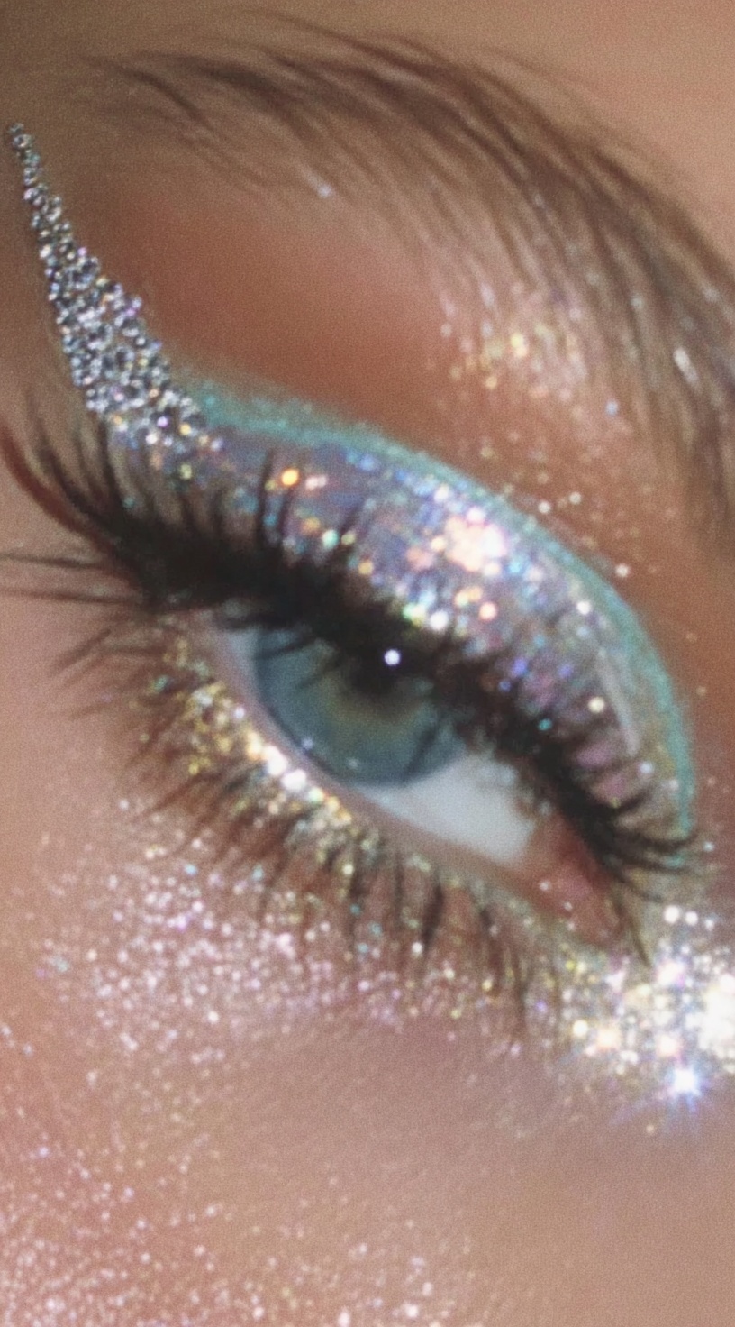
Quick Tip: Copy the prompt with the button above — paste it into Midjourney as-is (--ar and --style raw included). On DALL-E, Flux, Stable Diffusion, Ideogram, Leonardo AI or Firefly, keep the descriptive text and drop the -- flags. Start from the Kelvin value: change it first and watch how skin tone shifts before touching anything else.
Why “Holographic” Is a Lighting Instruction, Not a Color
I learned this while testing macro eye shots for a beauty campaign and kept getting teal-purple bands that looked like a cheap gradient tool. I had written “holographic teal-purple eyeshadow,” assuming the model would understand the material. It did not. It placed teal on one side, purple on the other, and blended the middle into rainbow mush. Real duochrome pigment has no fixed color. Its hue changes with the angle between the light, the surface, and the camera. That was my first clue: holographic is a lighting instruction, not a color name.
Thin-film interference explains why. A pigment flake gets coated in layers whose thickness is close to visible wavelengths. Light reflecting off the top and bottom of that film recombines, boosting some wavelengths and cancelling others. Rotate the surface, and the path length changes, so the surviving color changes too. For sparkling macro eye makeup photography, this matters because the camera sees a tiny area where angle shifts fast across the eyelid. If the prompt only gives two colors, the model renders a static blend. It cannot invent the angle-dependent behavior unless you describe the film and its shift.
My working phrase became “duochrome teal-to-violet pigment rendered as a smooth metallic film whose color shifts with viewing angle.” That gives the model a surface property plus a behavior. It no longer has to guess whether “holographic” means glitter, rainbow, or pearlescent. I also stopped using vague shimmer words. “Shimmering eyeshadow” creates uniform sparkle. “Rainbow eyeshadow” creates literal bands. “Metallic eyeshadow” creates a film without the shift. The prompt needs both pieces: the film quality and the angular change. Miss one, and the beauty campaign image looks like craft-store glitter instead of expensive pigment.
The same fix applies beyond eyeshadow. Any time a material’s color depends on viewing angle, describe the physical film and the angle-dependent behavior. For macro beauty work, that could be iridescent beetle-shell highlights, oil-slick lips, or duochrome nails. The model is not failing at color. It is failing at physics when you only give it color names. Holographic lighting language tells it how light should behave on a surface. Once that is clear, the teal-to-violet shift becomes a rendered optical effect instead of a painted gradient.
Kelvin, Ratio, and the Two-Light Setup That Keeps Skin Alive
Beauty macro photography lives or dies on how two lights of different color temperature interact across a curved surface. The original prompt's "5600 K cool key camera-left, 3200 K warm fill camera-right" is doing more work than it appears to. Those two numbers define a 2400 K separation, which is wide enough to be visible as color and narrow enough to still read as a single coherent lighting design rather than two competing photographs stitched together.
The mechanism is straightforward: skin is a translucent, layered material, and different wavelengths penetrate to different depths. Warm light (longer wavelength) travels further into the dermis before scattering back out, which is why 3200 K fill reads as glow rather than as a colored gel. Cool light at 5600 K reflects more from the stratum corneum, so it reads as surface texture — pores, fine vellus hair, the micro-glitter fallout on the cheekbone. Put a cool key on the texture side and a warm fill on the volume side and the skin renders as a body with a surface, not as a flat matte.
What breaks this is omission of the ratio. A prompt that says "dual-tone studio lighting" without a power relationship leaves the model free to balance both sources equally. Equal power at a 2400 K separation does not produce a gradient — it produces a muddy neutral, because the model treats the mismatch as a white-balance error and corrects it away. Stating "roughly 1:4" locks the key as dominant and demotes the fill to a shadow-lifter, which is exactly the job it should be doing. That ratio also preserves the shadow density that makes a macro eye read as three-dimensional; a 1:1 ratio would flood the socket and collapse the form.
Source size is the third variable, and it is the one most often left unstated. A small key source produces tight specular dots — one per glitter flake. A large soft source merges those dots into a continuous sheen. Since the entire visual premise of this image is granular sparkle, the key has to be small. If you want the same setup with a softbox, you are no longer shooting the same photograph.
Glitter as Geometry: Flake Scale and Why Uniform Sparkle Looks Fake
Glitter is not a texture you apply; it is a population of tiny mirrors, each with its own orientation. That single fact explains almost every failure mode in sparkle prompts. A model told to add "sparkle" has no distribution information, so it applies highlights uniformly across the surface — which reads as noise, a filter overlay, or digital static, because real flake populations are never uniform.
The fix is to specify scale and distribution as separate variables. In a real glitter wing, the largest flakes sit at the base near the lash line where the adhesive layer is thickest, and flake size decreases toward the tapered tip. That gradient is why the wing looks like it has weight and direction. Writing "flakes decreasing from roughly 2 mm near the lash line down to dust at the temple" gives the renderer a spatial rule it can execute across the whole shape, and the resulting highlight density naturally falls off toward the tip.
Fallout is the second variable. Micro-glitter on the under-eye and cheekbone is not decoration — it is evidence of application. Specifying it as "scattered" rather than "covered" keeps it sparse, and sparse highlights against skin texture read as physical particles. A dense scatter reads as a shader. The golden skeleton beauty prompt uses the same principle with metallic leaf: the value comes from placement rules, not from the metal itself.
Focus Plane, Magnification, and Where Sharpness Actually Goes
At 1:1 magnification on a 100 mm macro lens, depth of field at f/2.8 is measured in fractions of a millimeter. This is not a stylistic choice — it is a hard optical constraint, and it means the prompt must name which plane is sharp, because there is only room for one. "Tack-sharp focus on iris plane and glitter wing edge" is a spatial instruction. Everything else in the frame — brow, temple, the far edge of the eyelid — is legitimately soft, and that softness is what makes the sharp zone feel sharp.
Models default to a flatter interpretation of "macro" because the training distribution is dominated by images where more of the frame is in focus than physics would allow. If you do not explicitly assign the sharp plane, the renderer spreads detail across the whole eye, and the image loses the compression that makes macro photography feel close. Naming the iris and the inner edge of the wing as the two sharpest zones, with the temple falling off, restores that compression.
Medium-format rendering is worth understanding as a related variable. A larger sensor at the same magnification and aperture does not change depth of field much, but it changes how the out-of-focus regions are drawn — the falloff is smoother and the bokeh circles are larger relative to the frame. That is why "creamy circular bokeh background" pairs well with a medium-format reference: the background point sources become large, soft discs rather than small busy dots. If you want to experiment with how different platforms handle that falloff, the Midjourney parameter documentation is the clearest reference for how --style raw and aspect flags interact with rendering, and Adobe Firefly is useful for isolating texture behavior without the stylization that comes with a heavier aesthetic model.
For composition, the vertical 9:16 frame is doing specific work here. A horizontal crop would force the eye and the glitter wing into competition for the same visual weight. Vertical stacking lets the wing lead the eye upward along the brow line while the iris anchors the lower third — which is why the same lighting and material logic transfers cleanly to other fashion portrait structures, including the cubist fashion figure prompt, where the frame shape determines which plane reads first.
Conclusion
Once you start treating optical effects as geometry — angle, source size, ratio, flake scale, focus plane — the prompt stops being a description of a picture and becomes a set of physical constraints the renderer has to satisfy. That shift is portable. The next step is to apply it to a different material problem: try a wet-look glossy lid or a foil-stamped metallic lip using the same framework, specifying the reflective behavior and the light source geometry instead of the color. You will find that the same four or five variables do most of the work, and that the adjectives you used to rely on were never carrying the image at all.
Key Principle: Describe optical effects by the geometry that causes them — angle, source size, ratio, focus plane — rather than by the color or mood they produce. Physical constraints render; adjectives only approximate.